



How to Choose the Perfect Brand Colors | Step-by-Step Guide
Written By Virtuosity Editor Team
Updated 22 July 2026
Have you ever wondered why you quickly recognize brands like Coca-Cola, McDonald’s, or Starbucks even before you read their names? One of the main reasons is their consistent use of color. Colors are more than just visual elements—they shape first impressions, influence emotions and buying decisions, and make a brand more memorable. In today’s digital world, where customers see hundreds of brands every day, choosing the right colors can significantly impact how people perceive and remember your business.
However, choosing the best colors for branding is not simply about choosing your favorite color or following the latest trends. Your colors should match your brand’s personality, connect with your target audience, help you stand out from competitors, and remain consistent across your logo, website, social media, packaging, and other marketing materials.
Whether you are starting a new business, updating your visual identity, or improving your digital branding strategy, choosing the right colors is essential. In this guide, you'll learn how to choose a strategic brand color palette using color psychology, industry best practices, competitor research, and proven branding techniques to build a memorable and trustworthy brand.
Why Brand Colors Matter
Colors are a powerful part of how customers experience and remember a brand. Beyond shaping visual identity, they influence perception, create emotional associations, and help businesses build recognition. A thoughtfully chosen color palette can make every brand interaction feel consistent and distinctive.
-
Colors Build Brand Recognition: A consistent brand color palette strengthens visual identity, improves brand recognition, and makes your business more memorable. Include a verified statistic along with a real-world example, such as Coca-Cola (Red) or Starbucks (Green), to reinforce the point.
-
Colors Influence Customer Perception: A color shapes how customers interpret a brand, but avoid oversimplifying it as "blue always means trust." Perception also depends on industry, culture, context, and audience.
-
Colors Help Differentiate Your Brand: Researching and analyzing the colors used by competitors can help a business decide whether to follow industry trends or use different colors to create a unique identity.
How to Choose the Right Brand Colors (Step-by-Step)
Choosing the right colors for your brand can feel overwhelming, especially with so many options available. But with the right approach, the process becomes much simpler. Below are some practical ways to choose the right colors for your brand:
1. Define Your Brand Identity
A clearly defined brand identity gives your color decisions a strategic foundation, helping you build a visual branding direction that genuinely represents your business. Before selecting colors, establish a clear understanding of what your brand represents and the position you want it to hold in the market. Your color choices should be guided by the characteristics that define your business rather than personal preferences or temporary design trends. A financial brand built around security may favor a more professional visual direction, while a creative business may have greater freedom to explore expressive choices.
Focus on:
-
Core values: Identify the principles and beliefs that shape your business and its decisions.
-
Brand personality: Define whether your brand should feel bold, playful, minimal, innovative, sophisticated, or premium.
-
Brand positioning: Consider the distinct image you want to establish within your market and how you want your business to be recognized.
2. Research Your Industry & Competitors
Industry and competitor research provide valuable context for choosing colors that feel relevant to your market while establishing a recognizable visual identity of your own. Before finalizing your colors, study how established businesses and direct competitors use color within your industry. This research can reveal visual patterns that customers are already familiar with while highlighting opportunities for your brand to create a distinct presence. The goal is not to copy competitors or simply choose an unusual color, but to understand the market before making an informed decision.
Focus on:
-
Industry patterns: Identify commonly used colors and visual styles to understand the conventions within your market.
-
Competitor palettes: Compare the primary, secondary, and accent colors used by your closest competitors.
-
Opportunities to differentiate: Identify gaps where your brand can create distinction without appearing disconnected from its industry.
-
Real-world application: Examine how competitors maintain their colors across logos, websites, social media, packaging, and other relevant touchpoints.
3. Choose Your Primary Brand Color
Your primary color defines your visual identity and helps people recognize and remember it. Instead of choosing a color just because it looks attractive, think about how well it represents your brand and works in practice.
Before choosing your primary color, ask yourself these four questions:
-
Is it distinctive?
-
Is the exact shade right?
-
Is it versatile?
-
Can it work long term?
4. Build a Balanced Brand Color Palette
Once your primary color is selected, build a supporting brand color palette that gives you enough flexibility to design consistently across different applications. Instead of adding colors randomly, give each color a specific role within your visual identity. Each color should have a defined role and work together as a flexible visual system across your brand.
Build your palette in four layers:
|
Palette Element |
Role |
How to Use It |
|
Primary Color |
Your Brand Anchor |
The dominant color that represents your brand and creates the strongest visual recognition. Use it consistently across key brand elements to establish a clear and recognizable visual connection. |
|
Secondary Color |
Your Visual Support |
One or two complementary colors that support your primary color and add variety. Use them to create flexible color combinations for branding without competing with the dominant color. |
|
Neutral Colors |
Your Foundation |
Colors such as white, off-white, gray, beige, or black that provide balance and visual breathing space. Use them for backgrounds and supporting areas to help key brand colors stand out. |
|
Accent Color |
Your Attention Grabber |
A contrasting color used selectively to draw attention to important elements. Apply it to call-to-action buttons, links, icons, highlights, and other elements you want users to notice. |
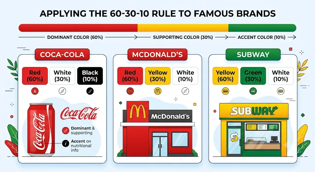
5. Apply the 60–30–10 Color Rule
The 60–30–10 ratio should be treated as a practical guideline rather than a strict formula. The exact proportions can change depending on the platform, but maintaining a clear hierarchy between dominant, supporting, and accent colors helps keep your visual branding consistent.
60% — Dominant Color: Use this color across larger visual areas, such as backgrounds or major sections, to establish the overall look of your design. It creates a consistent foundation without allowing multiple colors to compete for attention.
30% — Supporting Color: Use your secondary color across headings, content sections, graphics, or supporting design elements. It introduces contrast and visual variety while maintaining a clear connection with the dominant color.
10% — Accent Color: Reserve your accent color for high-priority elements such as call-to-action buttons, links, icons, or important highlights. Using it selectively makes these elements easier to notice and helps guide the viewer's attention.
See it in practice: Famous brands use this rule for instant recognition. As shown above, Coca-Cola dominates with 60% Red, while McDonald's uses 60% Red and 30% Yellow. Subway leads with 60% Yellow, creating a clear, balanced visual hierarchy.
Understanding Color Psychology in Branding
Color psychology is a useful starting point, but there is no universally “best” color for every business. The most effective brand identity colors are those that align with your brand personality, audience expectations, industry context, and overall positioning.
It explains how different colors shape the way people perceive a brand. While certain colors are commonly associated with specific emotions, their impact can vary depending on the industry, target audience, culture, and context. Understanding these associations can help you choose brand personality colors that support your identity and communicate the right message.
|
Color |
Communicates |
Industries Using |
Example |
|
Blue |
Trust, stability, calmness, and professionalism |
Technology, finance, healthcare, corporate services |
PayPal, Facebook, IBM |
|
Green |
Growth, health, freshness, nature, and balance |
Eco-friendly businesses, wellness, food, agriculture, finance |
Starbucks, Spotify, Whole Foods Market |
|
Red |
Energy, excitement, passion, urgency, and confidence |
Food and beverage, entertainment, retail, sports |
Coca-Cola, Netflix, YouTube |
|
Yellow |
Optimism, warmth, friendliness, and positivity |
Food, retail, children's brands, entertainment |
McDonald's, IKEA, Snapchat |
|
Orange |
Creativity, enthusiasm, friendliness, and energy |
Entertainment, food, technology, sports |
Fanta, Nickelodeon, SoundCloud |
|
Purple |
Creativity, imagination, sophistication, and luxury |
Beauty, technology, entertainment, luxury |
Cadbury, Yahoo, Hallmark |
|
Black |
Sophistication, authority, elegance, and exclusivity |
Luxury, fashion, automotive, technology |
Chanel, Nike, Apple |
|
White |
Simplicity, clarity, cleanliness, and openness |
Healthcare, technology, beauty, luxury |
Apple, Tesla |
|
Pink |
Playfulness, warmth, softness, and self-expression |
Beauty, fashion, lifestyle, entertainment |
Barbie, T-Mobile |
|
Brown |
Reliability, warmth, authenticity, and earthiness |
Food, agriculture, outdoor, logistics, artisan products |
UPS, Hershey's |
|
Gray |
Balance, neutrality, professionalism, and modernity |
Technology, automotive, corporate and professional services |
Mercedes-Benz, Apple |
|
Gold |
Luxury, achievement, prestige, and exclusivity |
Luxury, jewelry, hospitality, automotive |
Rolex, Lamborghini |
How to Combine Brand Colors Effectively
Choosing the right colors is only the first step. How you combine those colors plays an equally important role in creating a strong and consistent brand identity. Effective color combinations improve readability, establish a clear visual hierarchy, and create a balanced look across your website, logo, social media, packaging, and other marketing materials. By using the right mix of contrast and color harmony, you can create a brand that is both visually appealing and easy to recognize.
1. Create Enough Contrast for Readability
Contrast is the difference between colors that helps text, buttons, icons, and other important elements stand out clearly. A strong contrast makes content easier to read and creates a clear visual hierarchy, while poor contrast can make even an effective branding design difficult to navigate. For example, using black or dark text against a white background creates a clear distinction that supports readability. Similarly, choosing an accent color that contrasts with the surrounding palette can help important elements, such as call-to-action buttons, attract attention.
Think of contrast this way:
|
Good Contrast ✓ |
Poor Contrast ✕ |
|
Dark text on a white or light background |
Light gray text on a white background |
|
White text on a dark navy background |
Light blue text on a white background |
|
A contrasting accent color for CTA buttons |
Buttons that blend into the background |
|
Clearly distinguishable icons and interactive elements |
Similar colors that make elements difficult to identify |
2. Use the Color Wheel to Build Color Harmony
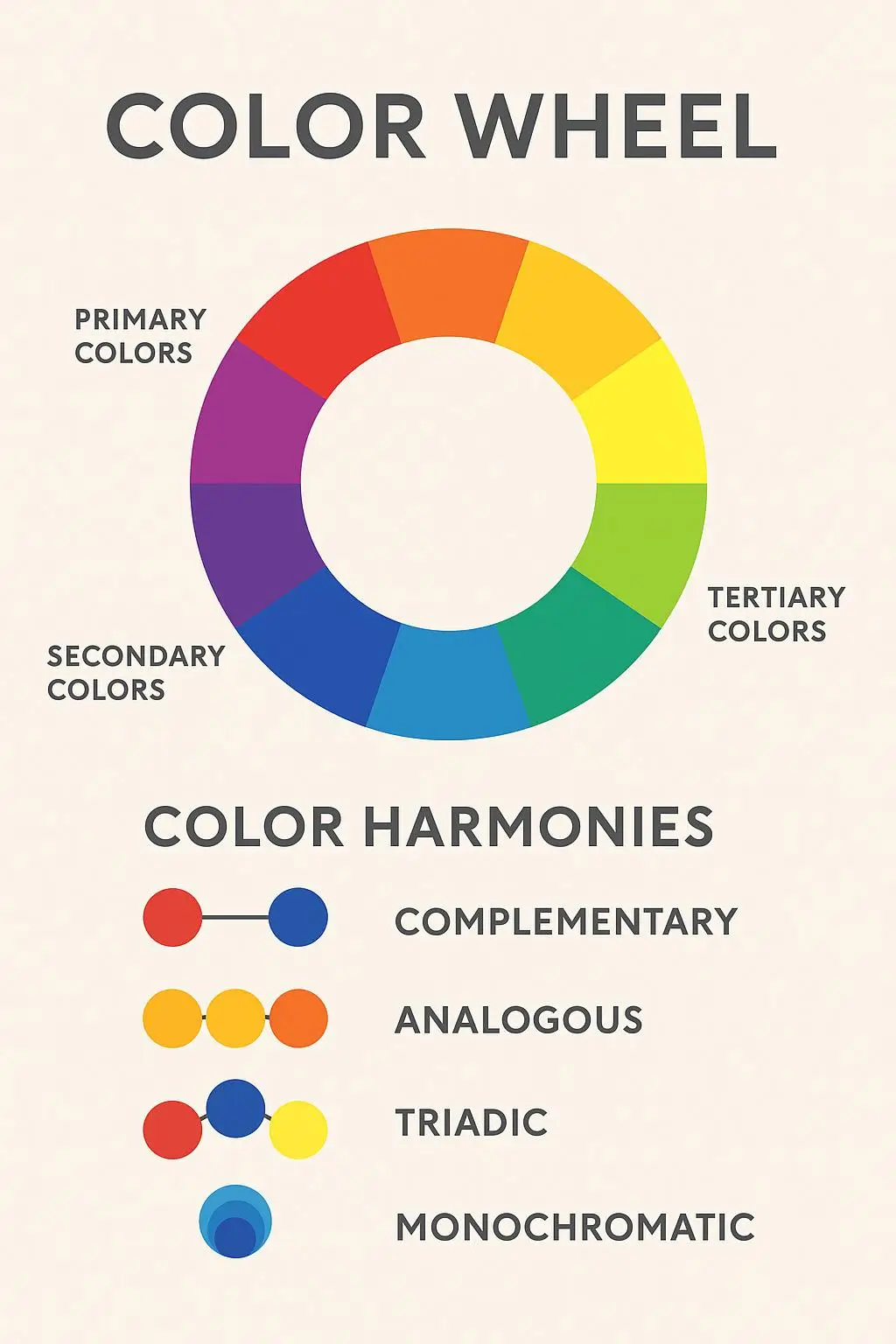
The color wheel provides a practical way to understand how different colors relate to one another, while color harmony refers to combining those colors in a balanced and visually pleasing way. Depending on the personality and branding design direction of your business, you can use different color relationships to build your palette.
-
Complementary (For Strong Contrast): Complementary colors sit opposite each other on the color wheel and create strong visual contrast. IKEA's use of blue and yellow demonstrates how contrasting colors can create a bold and highly recognizable visual identity. This approach works well when you want key elements or accents to stand out.
-
Analogous (For Natural Harmony): Analogous palettes pair colors adjacent on the color wheel, creating a smoother, more cohesive appearance. For example, a wellness brand might combine green with nearby blue-green or yellow-green shades to create a fresh, nature-inspired palette without introducing harsh visual contrast.
-
Monochromatic (For a Unified Look): A monochromatic palette uses different shades, tints, and tones of a single base color. PayPal, for example, has used multiple shades of blue in its visual identity, showing how variations of a single color can add depth while maintaining a cohesive and recognizable appearance.
-
Triadic (For Balanced Variety): A triadic palette uses three colors positioned evenly around the color wheel, creating greater visual variety while maintaining balance. Google's branding demonstrates a broader multi-color approach, where distinct colors work together to create an energetic and approachable identity. When using multiple colors, keeping their roles clearly defined helps prevent the overall design from feeling overwhelming.
Best Tools to Create a Brand Color Palette
Creating a brand color palette is easier when you use the right tools. Whether you're exploring color combinations, building a balanced palette, extracting colors from an image, or testing different visual styles, these tools can help you make informed decisions before finalizing your brand colors.
|
Tool |
Best For |
How It Helps |
|
Adobe Color |
Exploring color harmony |
Use the interactive color wheel to experiment with complementary, analogous, triadic, monochromatic, and other color relationships when building your palette. |
|
Coolors |
Generating color palettes quickly |
Generate different color combinations, adjust individual shades, lock colors you like, and explore alternatives until you find a balanced palette. |
|
Canva Color Palette Generator |
Creating palettes from images |
Upload an image that reflects your desired visual direction and extract its dominant colors to use as inspiration for your brand palette. |
|
Khroma |
Discovering personalized color combinations |
Explore AI-generated color combinations based on your preferences, making it useful for discovering combinations you may not have considered manually. |
|
Color Hunt |
Finding palette inspiration |
Browse curated color palettes to explore different combinations and gather inspiration before developing a more customized brand color system. |
Test Your Brand Colors Before Finalizing
Before committing to your final brand color palette, test how the colors perform in the situations where customers will actually see them. A palette that looks great in a design file may behave differently across screens, printed materials, or different backgrounds. Use this checklist to identify potential issues before making your colors a permanent part of your visual identity.
-
Website Test: Apply your colors to essential visual branding elements, including website backgrounds, headings, buttons, links, and calls to action. Check whether the overall design feels balanced and important elements are easy to identify.
-
Mobile Test: Review your colors on different mobile devices and screen sizes. Make sure text remains readable, interactive elements are clearly visible, and your brand colors maintain their intended appearance.
-
Print Test: Print samples of your logo and brand materials to see how your colors reproduce outside a digital screen. Colors can appear differently in print, so review important applications such as business cards, brochures, packaging, or signage.
-
Dark Mode Compatibility: Check how your palette performs against both light and dark backgrounds. You may need alternative shades or variations to maintain readability and preserve your brand's visual identity in dark mode.
-
Customer Feedback: Show realistic examples of your branding to a small group of people who represent your target audience. Ask what qualities or impressions the colors communicate and compare their responses with your intended brand positioning.
-
Accessibility Review: For accessible digital design, aim to follow Web Content Accessibility Guidelines (WCAG). WCAG Level AA requires a minimum contrast ratio of 4.5:1 for normal text and 3:1 for large text. Testing your brand color combinations against these standards can help ensure that website content, buttons, and other important elements remain readable for a wider range of users.
Conclusion
Remember, there isn't a single "perfect" color for every brand. The best colors for branding are those that make sense for your business and work effectively wherever your audience encounters them. Rather than settling on the first appealing combination, explore your options, consider how each color contributes to the overall identity, and test the final palette in practical situations. With a thoughtful approach to color selection, you can create a visual foundation that feels intentional, remains flexible, and continues to support your brand as it grows.